Archive for the ‘Art’ Category:
A Picture Says …What?
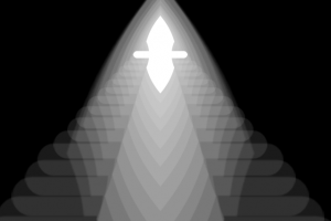
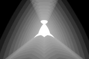
In my freshman graphic design classes, we were not allowed to use color. You have to learn to stand before you can learn to walk, right? We were given a simple set of rules to live by: contrast, repetition, alignment and proximity (lovingly abbreviated to CRAP.) Our first assignment was to convey concepts like heavy, light, harmony, etc., using only the first letter of the idea. No fancy fonts, just Myriad Pro Bold. No stretching, scaling or otherwise warping of the letter – it was all about placement (we were, thankfully, allowed to use each letter multiple times.) With the simplistic, monochromatic styling of Influence, I’ve found myself revisiting those early lessons. I decided to approach the task of illustrating the idea behind each allegiance with similar restrictions. Using only the insignia and the black-and-white world that Influence embodies, I set out to turn 1000 words into a picture. (I did take some liberties with scale and opacity, but I think I’ve earned it!)
Faserdi and Sospili are both allegiances about power. As such, their illustrations look very similar. The big difference, however, is that Faserdi is about answering to a higher power, whereas Sospili is about power that comes from within. Just by changing the perceived angle this difference is conveyed.
Id Design
We’ve run into a problem with the boid design. Currently, there are 8 unique boids. Their shapes are arbitrary, however, which will make it difficult to design more powerful boids for the campaign mode. How do you show the same boid but with higher stats? It’s not really the same boid anymore. So we are moving to a more modular approach in the boid design.
There are three main attributes in a boid: agility, resistance and speed. Each of these attributes will have a physical presence on the boid that builds up as stats increase. This way, players will be able to tell how strong a boid is just by looking at it. This also means we don’t have to design 200+ boids in order to represent every combination possible in the game (and the player doesn’t have to memorize them!)
Psychedelics
We decided that a PC version of Influence could help us create a unifying force across the mobile platforms. It could act as a hub, and we’d have an IP we could (relatively) easily slap into any new mobile that contained the Kionix accelerometer.
Turning back to the PC gave us new graphics potential. We started by adding in the new boids and focusing on differentiating them when people were playing. The idea came up to make the tails of each boid type different, because the silhouettes, while decently differentiable when zoomed out, weren’t good enough at a quick glance. Observe the psychedelic results:
[nggallery id=8]
You can also see in the graph that we started weeding the filigree out of the UI again, settling for a subtle grid. We wanted the physics to be able to carry the game alone – the filigree took up too much visual interest. Minimal was the way to go.
The Boids
In the original Processing demo, the boids were little more than wandering triangles. While this wouldn’t cut it for Microsoft’s sexy factor, but there were huge advantages to the triangles I wasn’t willing to give up.
- Minimalism – The triangles were not organic or inorganic, space ships or wandering viruses. They had no narrative attached to them, no weight. They were symbols that players could interpret however they pleased. That sort of narrative minimalism is powerful. It invites players deeper into the world as they invest more of their imagination. The more imagination players supply, the more customized the experience. The developer’s world becomes their world, as it should be.
- Simplicity – Perhaps a subcategory of minimalism, the triangles were simple – their silhouettes were easy to see and differentiate. They conveyed orientation information and created a streamlined feel. They accentuated the natural motion of the flocking algorithm, which was the key point of the game.
As we decided that there should be multiple boids, and that those boids should be another factor in differentiating players, I asked for concepts that were simple, with distinct silhouettes, and neither organic or inorganic.
[nggallery id=6]
Some were stripped out for being too intricate, too “ship like”, or too geometric. As quickly as we decided to go with “ships” for Microsoft we backed off that plan and decided that narrative minimalism was essential to our core.
[nggallery id=7]
Sexy Elegance?
As we put Influence onto the Zune we had to start thinking about UI. We didn’t want it to be too technical, too flashy, or too textured. We wanted something simple and elegant that couldn’t be associated with any particular style. In the end, we decided on a filigree-esque interface that highlighted the elegance and added a lot of visual interest. Though the filigree could have been associated with an old-fashioned vibe, we thought it was shiny and clean enough to veer away from that.
Below are the screenshots from the first iteration of the game, where people could pick color, allegiance, and the type of ship they wanted. At this stage, the ship type was purely aesthetic. There was also a graph at the end of the game which showed the progress of the game over time.
[nggallery id=5]


