Author Archive
Yes, we are still alive…
Influence has officially been sent off for approval to the guys providing our internet playability. We hope to hear back from them soon so we can release a new beta! In the meantime, check out the latest screenshots. They reveal the new way to customize your ids, some changes to the menus and the capability for full-screen goodness with neutral/adversary indicators.
[nggallery id=12]
One of These Things is Not Like the Other…
In the interest of releasing Influence before the end of the year and also releasing something that is not sloppily thrown together, we have decided that ‘Explore Alone’ will be better as a separate game entirely. There are just too many things about it that make it completely unrelated to multi-player and ‘Daydream’. As such, we have reached a consensus (haha!) that ‘Explore Alone’ needs a major overhaul and it does not seem realistic to try to pull it all together by the end of the summer (our current self-imposed deadline.) That was our mistake last time and we are loath to make it again. As far as feedback has gone, no one is going to miss ‘Explore Alone ‘ in its current state. That makes this decision easier too.
As for progress, we have internet multi-player working (with chat!) So we’re definitely in the home stretch and hoping to have a new beta ready in the fall.
Zooming Along
To further increase the immersion experience, we’ve enabled panning sound. This means that when you are zoomed in, an adversary off to your left will sound from the left speakers. Pairing this up with the trailing rings really gives you a heads-up to where things are happening when the whole plane isn’t visible, and adds more variation to the music. It is also now possible (again) to select an id to focus on so that the camera doesn’t bounce between split flocks.
Other updates:
- The re-designing of Explore Alone is taking us a bit of time, but in a pleasing, more interesting direction.
- We’ve got a plan to make id selection more customizable and consistent across the game.
- On the white board are sketches for a more cohesive level select screen.
These are some exciting (scary-roller-coaster exciting) times for us and the long uphills have given way to screaming downhills that make it all worthwhile. We’re almost to the top with Influence, and hanging on tight in the front car.
Drum Roll, Please
We found that while the WordPress blog is great for, well, blogging, it is not so great for displaying the other aspects of the Influence project. So without further ado, let us introduce the new and improved playinfluence.com. I moved all of the non-blog content over and added more images. There are also some new goodies sprinkled about, with more to come. Stay tuned, kiddies!
A Picture Says …What?
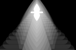
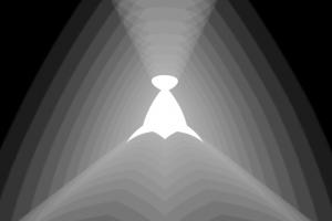
In my freshman graphic design classes, we were not allowed to use color. You have to learn to stand before you can learn to walk, right? We were given a simple set of rules to live by: contrast, repetition, alignment and proximity (lovingly abbreviated to CRAP.) Our first assignment was to convey concepts like heavy, light, harmony, etc., using only the first letter of the idea. No fancy fonts, just Myriad Pro Bold. No stretching, scaling or otherwise warping of the letter – it was all about placement (we were, thankfully, allowed to use each letter multiple times.) With the simplistic, monochromatic styling of Influence, I’ve found myself revisiting those early lessons. I decided to approach the task of illustrating the idea behind each allegiance with similar restrictions. Using only the insignia and the black-and-white world that Influence embodies, I set out to turn 1000 words into a picture. (I did take some liberties with scale and opacity, but I think I’ve earned it!)
Faserdi and Sospili are both allegiances about power. As such, their illustrations look very similar. The big difference, however, is that Faserdi is about answering to a higher power, whereas Sospili is about power that comes from within. Just by changing the perceived angle this difference is conveyed.
Id Design
We’ve run into a problem with the boid design. Currently, there are 8 unique boids. Their shapes are arbitrary, however, which will make it difficult to design more powerful boids for the campaign mode. How do you show the same boid but with higher stats? It’s not really the same boid anymore. So we are moving to a more modular approach in the boid design.
There are three main attributes in a boid: agility, resistance and speed. Each of these attributes will have a physical presence on the boid that builds up as stats increase. This way, players will be able to tell how strong a boid is just by looking at it. This also means we don’t have to design 200+ boids in order to represent every combination possible in the game (and the player doesn’t have to memorize them!)


